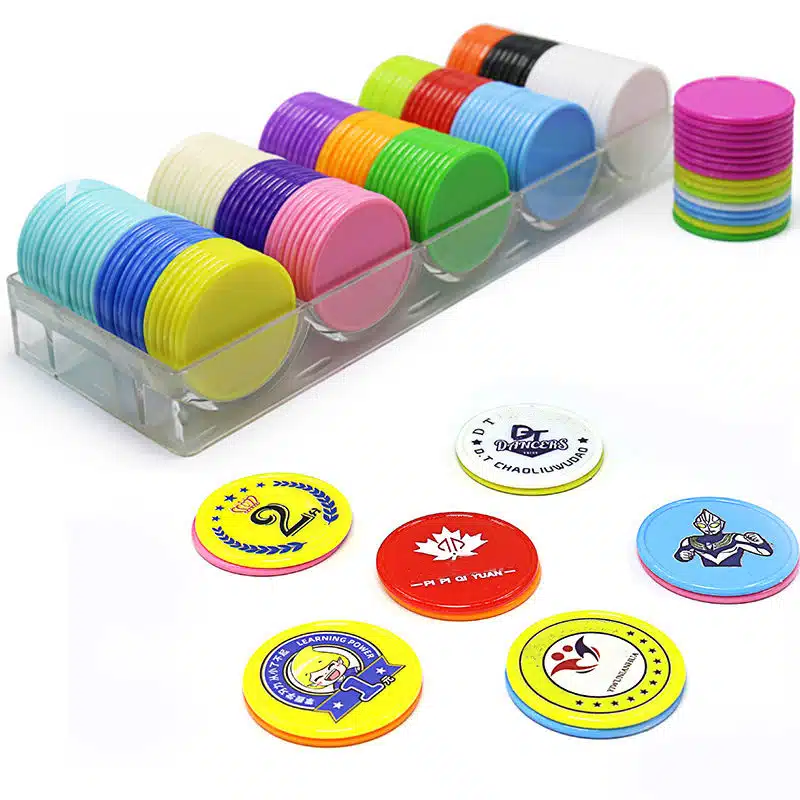
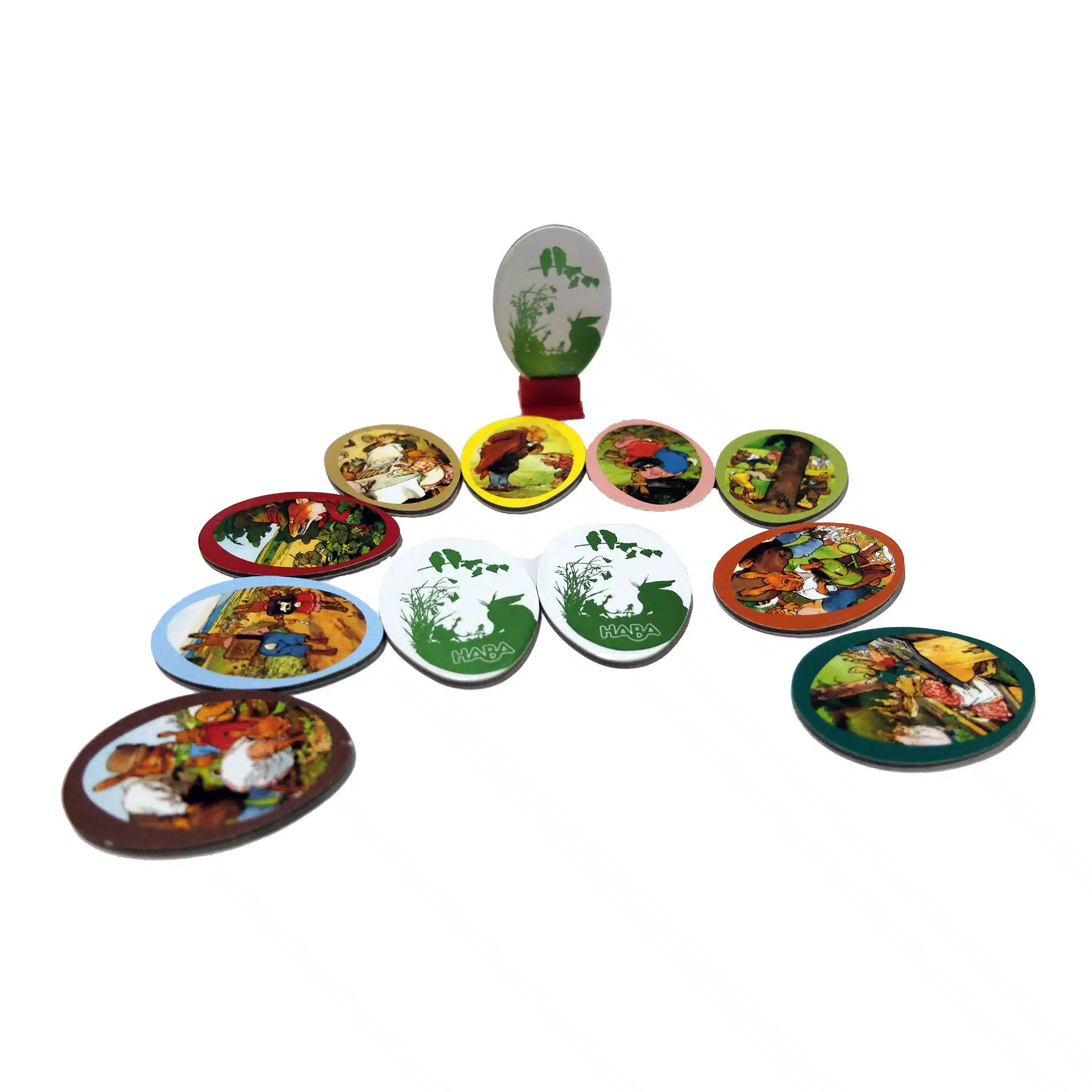
Custom Game Tokens
for Board Games & Tabletop Games
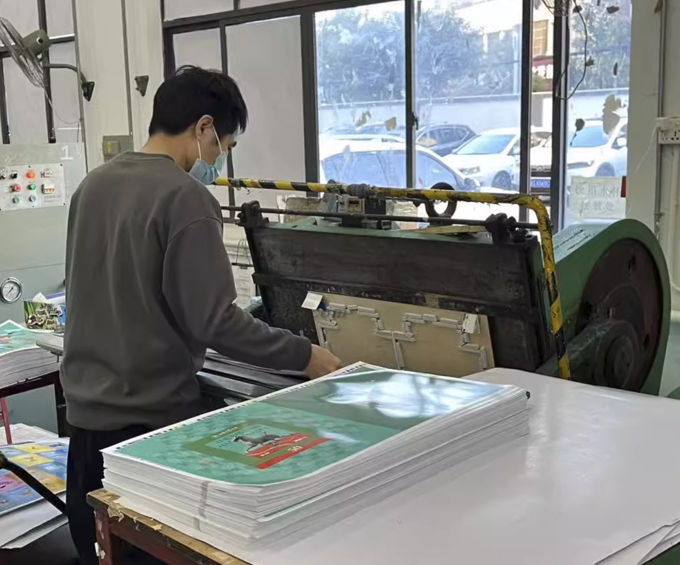
Game tokens are not minor accessories. They get picked up, sorted, stacked, punched out, and rubbed across the table in almost every session. If thickness drifts, stacks lean and trays stop fitting cleanly. If the board stock is too soft, edges crush during punching. If the artwork uses thin borders or centered rings, normal die-cut drift of about ±0.2 to 0.3 mm can already look like a printing defect to the end user.
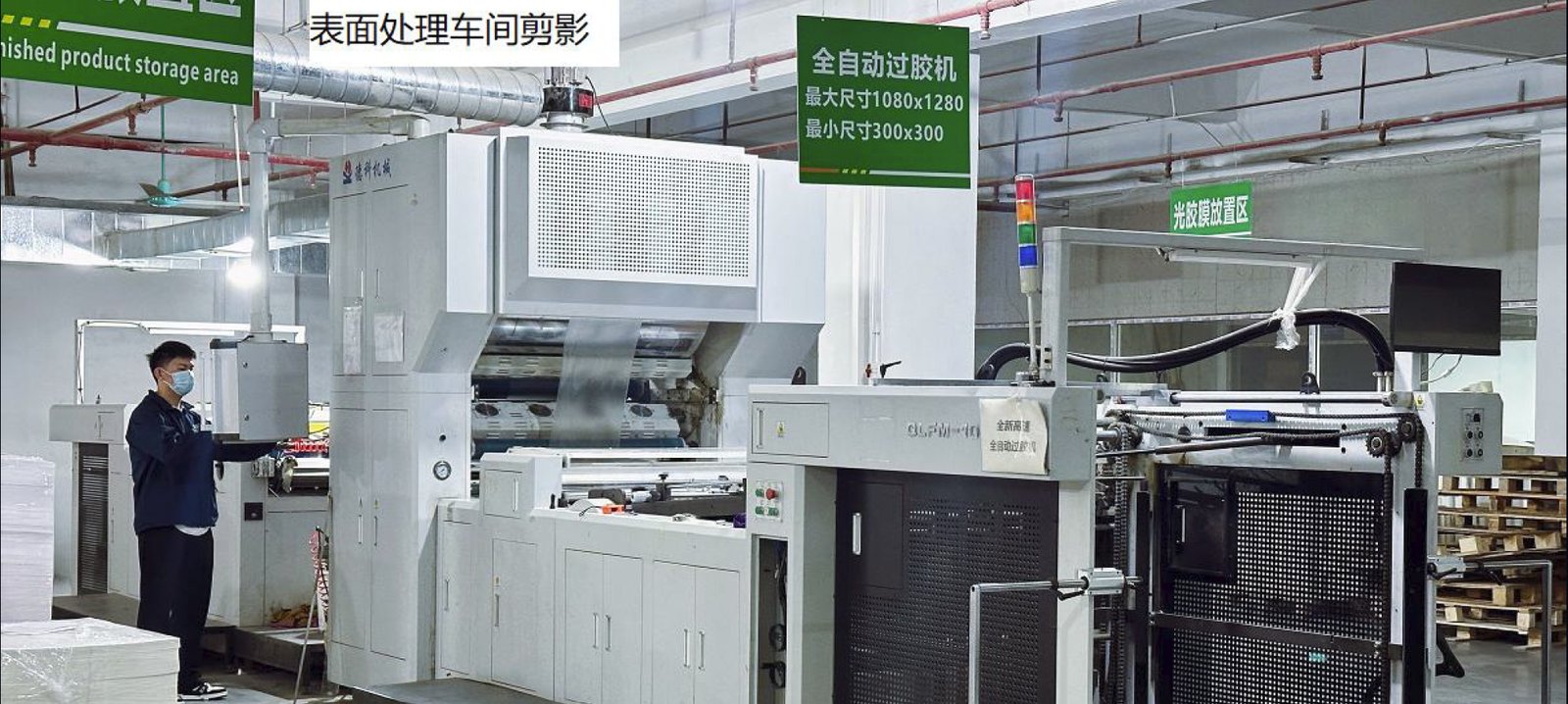
At Funway, we build token production around how the pieces will actually be used. Punchboard is still the practical route for high-count printed sets. Acrylic or plastic only makes sense when transparency, washability, or part separation really matters. Wood works when hand feel matters more than full-surface graphics. Thickness, die line, surface treatment, and packing geometry are checked together, because a token can look fine on screen and still fail later in punching, stacking, bagging, or insert fit once the job goes into volume production.
We Provide All options for Custom Game Tokens
Materials & Component Systems
Token material is chosen based on use case, not artwork alone—especially how it will be handled, stored, and sorted.
Cardboard is the default for most printed tokens. Plastic is used for higher durability or molded forms. Acrylic is for clear or tinted visual effects, not standard use. Wood fits tactile, simple designs without detailed printing.

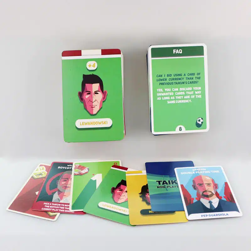
Cardboard Tokens (The Industry Standard)
Cardboard is the practical default for most printed tokens, especially high-count sets like resources, markers, and counters.
Token issues are less about layout and more about handling: stacking, sorting, tray fit, and edge wear. Soft stock can crush during punching, and small die shifts (±0.2–0.3 mm) can already break visual alignment on thin borders or centered icons.
Typical thickness is 1.5–2.5 mm. Lighter sets can stay thinner, while frequently handled or stacked tokens need more stiffness to avoid feeling low quality. Cardboard works best for information-heavy tokens; heavy-duty use cases usually require other materials.
Injection-Molded Plastic Tokens (The Workhorse)
Plastic tokens are used when the piece behaves like a durable game component rather than a printed counter—supporting frequent stacking, flipping, or heavy handling.
However, plastic introduces tooling, shrinkage, gating, and adhesion constraints, so it is not simply a premium upgrade. For flat, information-only tokens, it often increases cost without clear benefit.
Common issues include visible gate marks, inconsistent stacking thickness, and wear on printed areas. Material choice (ABS, PS, PP) depends on rigidity and use, but plastic is only justified when durability or structure is truly needed.
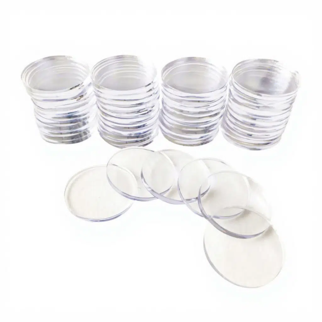
Acrylic Tokens (The Deluxe Upgrade)
Acrylic tokens are used when transparency or tinting adds real gameplay value, such as resource gems or high-visibility markers.
They behave more like display materials: edges can chip, surfaces scratch easily, and high-count sets add weight and cost. Low-contrast printing can also become hard to read.
Best suited for special-purpose pieces, not general high-volume tokens or information-heavy counters.
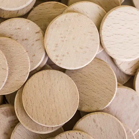
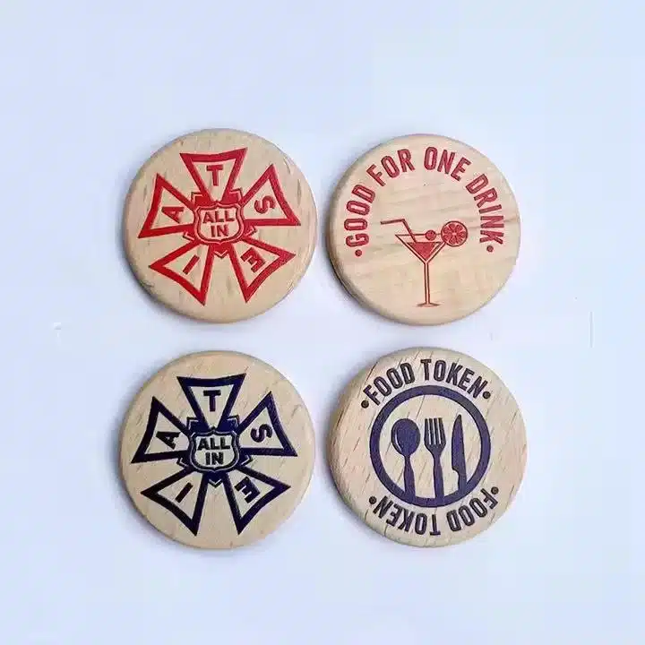
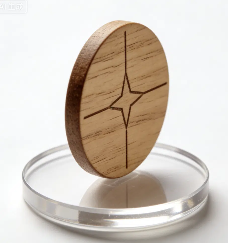
Wooden Tokens (The Organic Classic)
Wood tokens are chosen for tactile feel and physical presence, common in resource systems, abstract games, and Euro-style designs.
They are less suited for detailed printing, as grain, moisture, and edge wear affect quality over time. Thin shapes can chip, and print durability is limited.
Best used for simple shapes and tactile differentiation; for detailed graphics or heavy information, cardboard is usually more practical.
Token Sizes, Thicknesses & Handling Considerations
Token size is defined by usability and total set count, not artwork alone. Poor sizing scales into problems across the entire game.
Thickness must also match use: too thin feels low quality, too thick affects stacking, storage, and box volume. Size and thickness are functional decisions, not visual ones.
Common Thickness Options
18–20 mm: For small counters and high-count sets, but limited space for detail and less comfortable handling.
25 mm: Balanced standard size with enough room for simple icons and good usability.
30–35 mm: Better readability and grip, but increases space and storage impact.
40 mm+: For special markers or key components; behaves more like a board piece than a standard token.

Thickness Options for Printed Cardboard Tokens
1.5 mm: Suitable for light-use, high-count tokens with limited handling, but can feel thin and wear faster with frequent use.
2.0 mm: Standard balance of stiffness, feel, and durability for most printed token sets.
2.5 mm: Better for frequently handled or stacked tokens, but increases storage and packaging impact.
Stack Height, Tray Fit & Box Space
High-count token thickness becomes a packing issue quickly. Small changes per token multiply into large stack height, affecting trays, bags, and box fit. That’s why thickness is always checked together with total count and packing method, not treated as a simple upgrade.

Small Tokens, Fine Artwork & Readability Risk
Small tokens are sensitive to complex artwork. At 18–20 mm, fine details like thin borders or tight layouts can break easily with small die shifts. They work best with simple, bold designs and clear spacing, as over-detailed artwork often degrades in production.
Token Shape Variants & Gameplay Applications

Small tokens do not forgive busy artwork. At 18 mm or 20 mm, a centered ring, thin border, or detailed icon is already risky. Once the die shifts by about ±0.2 to 0.3 mm, that kind of layout starts looking wrong very quickly.
That is why small tokens need simpler artwork, stronger icon hierarchy, and more breathing room around the edge. If the token is tiny and the design still tries to do too much, the result usually looks worse in production than it did in the file.
Round Tokens
Round tokens are the default for high-count counters like resources, currency, and scoring because they handle, stack, and sort cleanly.
However, they reveal alignment issues easily. Centered rings, thin borders, and circular layouts are sensitive to die-cut drift (±0.2–0.3 mm). Wider borders or simplified designs help maintain a cleaner production result.
Square & Rectangular Tokens
Square and rectangular tokens provide more usable space for icons, numbers, and labels, making them suitable for status markers, ownership markers, and information tokens.
Their main weakness is corner wear. Sharp edges tend to chip during handling and storage, so adding a slight corner radius improves durability without affecting function.
Irregular or Icon-Shaped Tokens
Icon-shaped tokens improve table readability and quick sorting by using intuitive silhouettes.
However, complex shapes introduce production risks. Thin bridges, sharp points, and deep cuts are prone to damage and poor punching. Features under 2–3 mm should be simplified or reinforced.
They also stack and pack less efficiently, so for high-count sets, practicality often outweighs custom shape. Notches or locking features require special structural consideration due to wear and fit issues.
Color Application, Printing & Surface Finishing
Token printing must be evaluated at actual size, not just on the artwork sheet. Designs that look clear on screen can become crowded at 18–25 mm, where small details and tight layouts are more affected by production tolerances. Because tokens are frequently handled—pinched, flipped, stacked, and stored—wear often appears first on edges and high-touch areas. Printing, finish, die line, and packing should be considered together to ensure durability.

Offset Printing for Cardboard Tokens
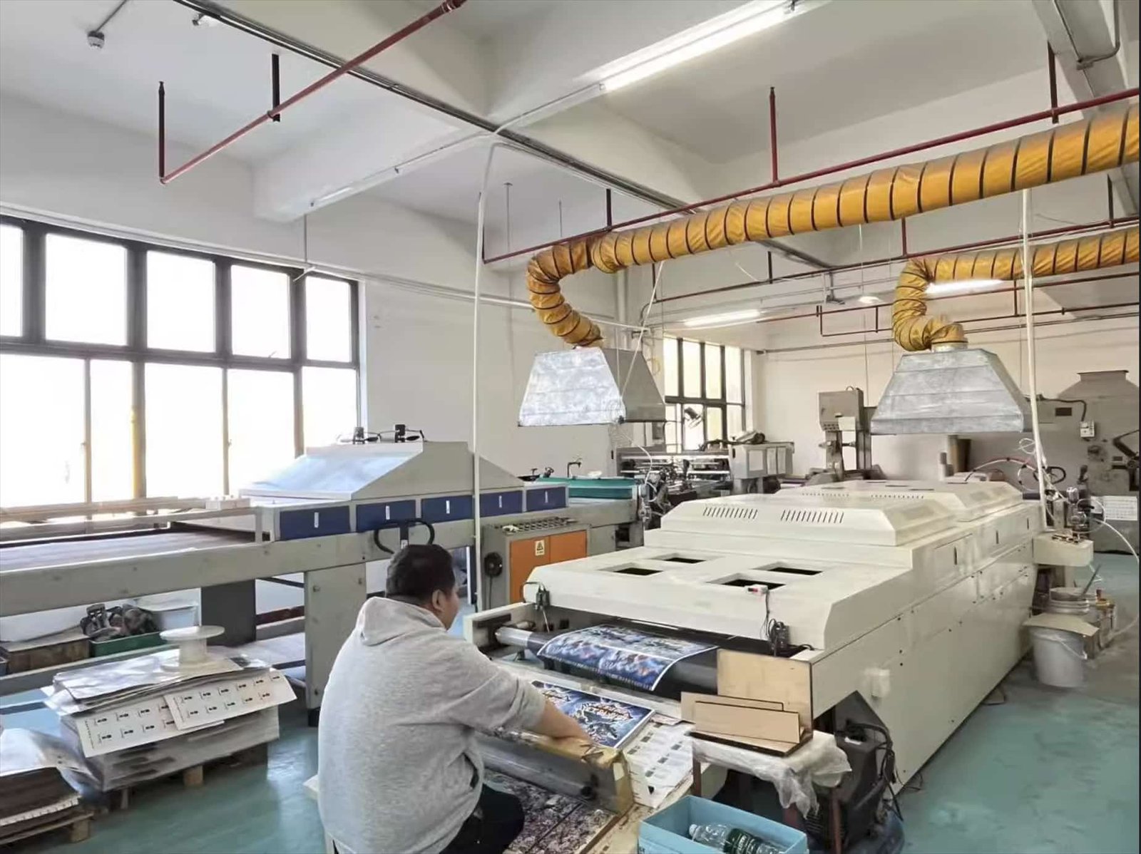
Cardboard tokens are typically offset printed, then mounted, finished, and die-cut, making them ideal for detailed icons, numbers, and double-sided artwork.
The main risk appears after die-cutting. Small tokens, especially round ones, expose alignment shifts (±0.2–0.3 mm), making thin borders, centered rings, and edge details look uneven.
To avoid this, artwork needs proper bleed beyond the cut line and a safe margin for key elements. For double-sided tokens, front-to-back alignment must also be controlled, as small registration shifts become noticeable during play.

Surface Protection for Cardboard Tokens
For cardboard tokens, surface protection comes from varnish or lamination. Varnish is lighter and more cost-effective, but offers limited edge protection, so wear shows sooner on dark borders and high-touch areas.
Lamination improves durability, yet requires careful control. Weak bonding can cause edge lifting, while thicker films may affect cutting precision on small or intricate shapes.
Finish choice should prioritize usability over appearance. Tokens must withstand repeated handling, and excessive gloss can reduce readability by introducing glare.
Printing & Marking on Plastic Tokens
Plastic tokens rely on the molded surface for print quality. Flat areas are easier to print, while raised edges, recesses, curves, or textures increase difficulty and wear risk.
Pad printing is preferred for simple icons and marks. UV printing can work on flat surfaces, but detailed full-color designs are rarely suitable unless the structure requires plastic.
Adhesion is the main risk. Prints may look fine initially but wear at high-touch points, so durability testing is essential before production.
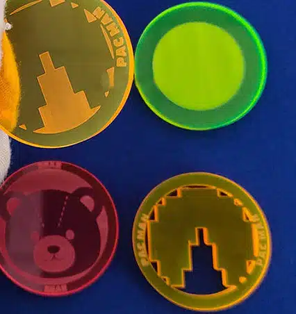
Printing & Marking on Acrylic Tokens
Acrylic tokens rely on their clear or tinted appearance, so markings should stay simple. Clean icons, numbers, or symbols work better than dense, full-surface graphics.
Surface printing is easier to read but more exposed to scratches. Back printing protects the ink, though the acrylic alters how colors appear, especially with tint or thickness. Engraving is durable but can lack contrast if not planned carefully.
Acrylic works best for visual effect pieces. For detailed information, cardboard is usually more reliable, and proper packing is needed to reduce scratching and edge damage.
Laser Engraving & Printing on Wooden Tokens
Wooden tokens work best with simple, bold markings—one icon, number, or symbol. Detailed graphics, small text, or multi-color designs do not translate well and are better suited to cardboard.
Laser engraving depends on contrast. It shows clearly on light wood but can appear weak on dark or small pieces, especially with fine lines.
Printed wood faces similar limits. The surface is less consistent, and wear appears quickly on edges and high-touch areas. For complex or detailed designs, cardboard remains the more reliable choice.
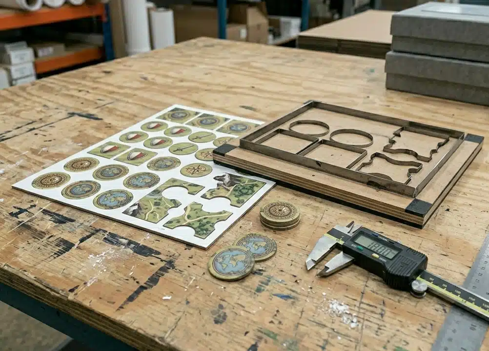
Spacing on the punch sheet also matters. If tokens are placed too close together, punching becomes less forgiving and edge quality becomes harder to control. For small round or centered layouts, we usually add more breathing room instead of trying to make the artwork look perfectly tight in the file. The file may look cleaner that way, but production usually does not.
Transparent Pricing
Custom Game Tokens Pricing Examples
See real-world pricing examples for popular board game styles. Every project is unique. these estimates help you plan your budget before requesting a detailed quote.
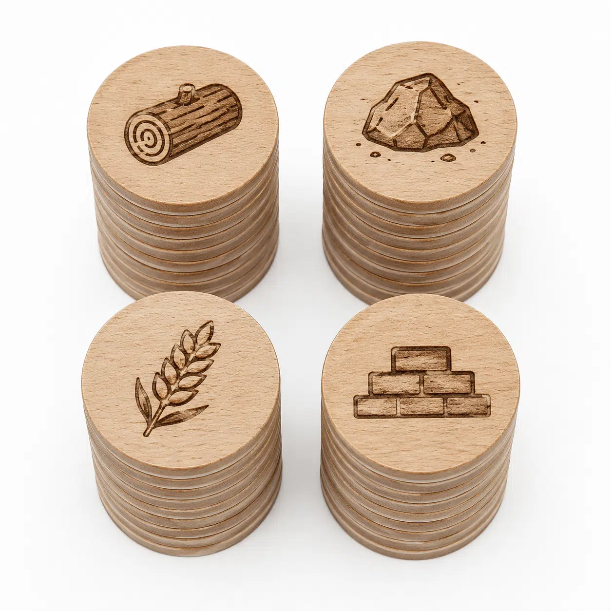
Wooden Resource Tokens
Classic wooden tokens for tracking resources and game materials
Component | Specification | Qty |
|---|---|---|
Dimensions | 25mm Diameter | 100 pcs |
Material | 3mm Beech Wood | / |
Processing Type | Laser-engraved Icons | / |
Surface Finish | Natural Finish | / |
Printing Sides | Single Side | / |
Estimated Quote (1,000 units)
$5 – 14 / set
Lead time: 15-60 days
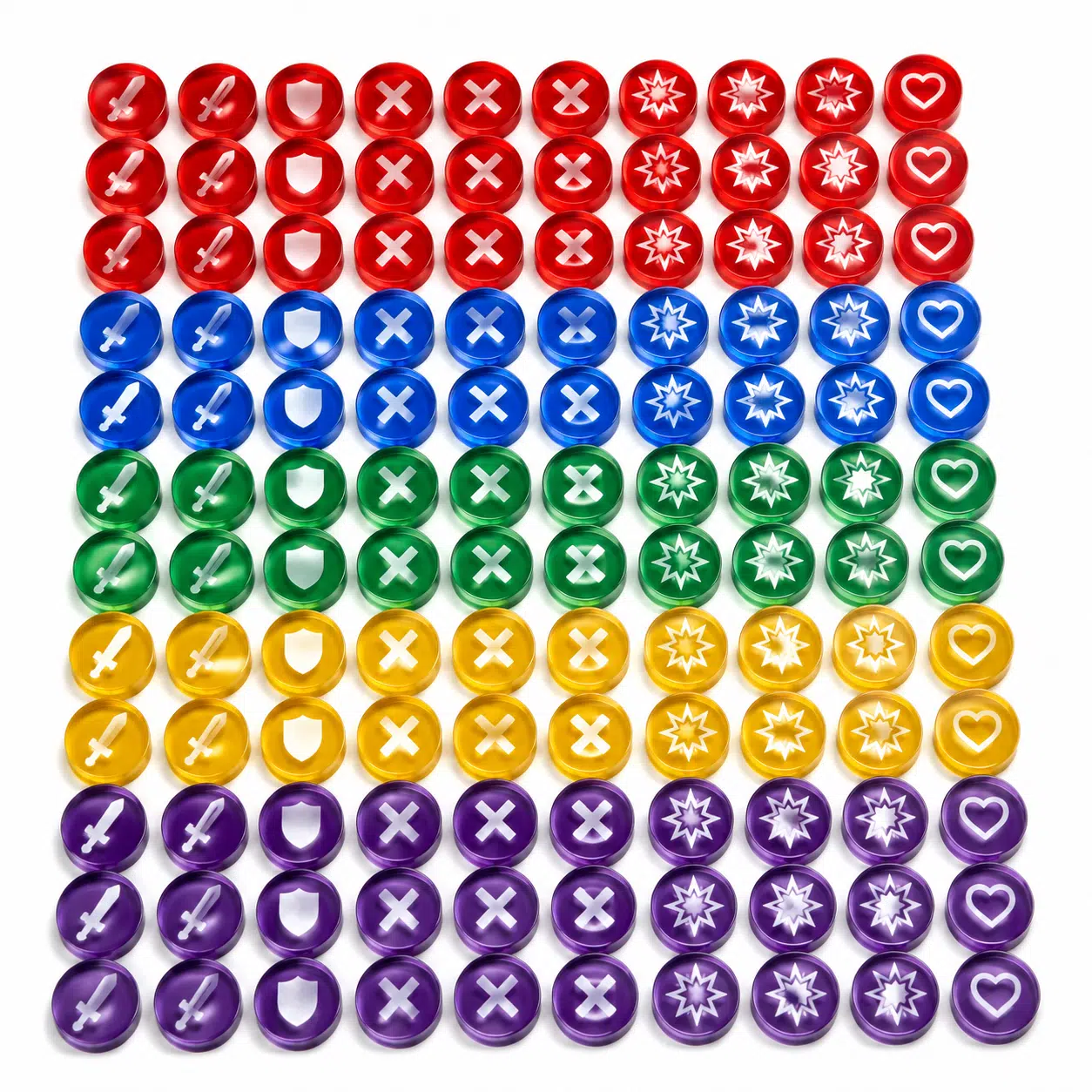
Acrylic Status Tokens
Clear acrylic tokens for marking effects, status, and conditions
Component | Specification | Qty |
|---|---|---|
Dimensions | 15mm Diameter | 100 pcs |
Material | 3mm Colored Acrylic | / |
Processing Type | Printed Icons | / |
Surface Finish | Glossy Finish | / |
Color | 5 Colors | / |
Estimated Quote (1,000 units)
$6 – 18 / set
Lead time: 15-60 days
Understand Your Costs
Deep-dive guides to help you budget, plan, and avoid surprises.
Individual Component Pricing
Need a quote for just one component? Check individual pricing for each sub-service.
Ready to Get Your Exact Quote?
These are estimates. Your game is unique. Send us your specs and we’ll return a detailed, itemized quote within 24 hours.
Complete Custom Board Game Components
A board game is a system of interconnected components. At FUNWAY, we manufacture every element — from the board and box down to the smallest token — as one integrated production, not separate parts. Here are all the customizable components that go into a complete board game. And of course, you can choose to customize the whole or just a part of it.
| Folded or rigid boards up to 600×900mm with hinge alignment and surface finishing | |

| Telescope, rigid, and magnetic boxes engineered for fit and stacking strength | |

| Neoprene play surfaces and foldable player screens | |
| Cardstock selection, clean cutting, and coatings for stable shuffling | |

| PVC and resin figures with mold review and scale consistency control | |
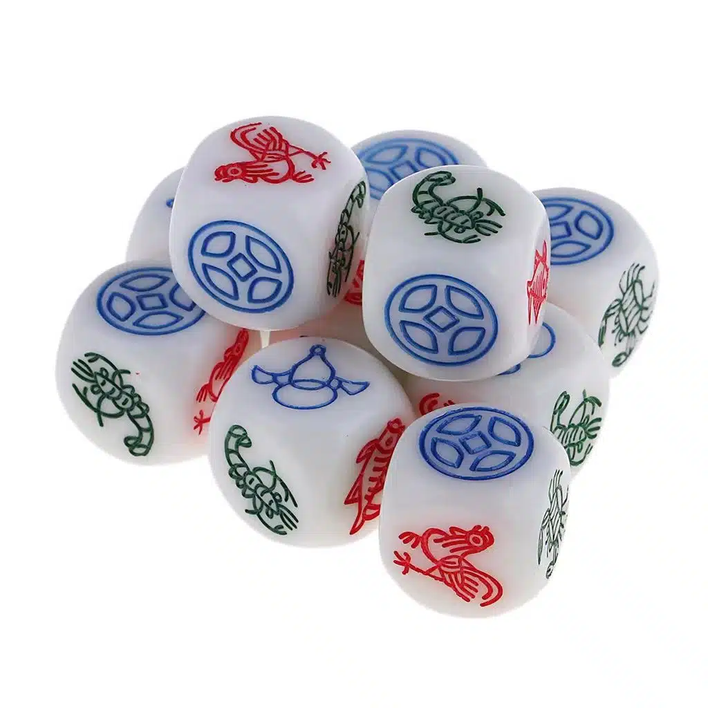
| Precision dice in multiple materials, sizes, and custom face designs | |
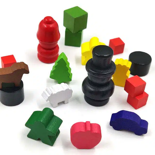
| Player markers in wood or plastic with precise silhouettes and color control | |
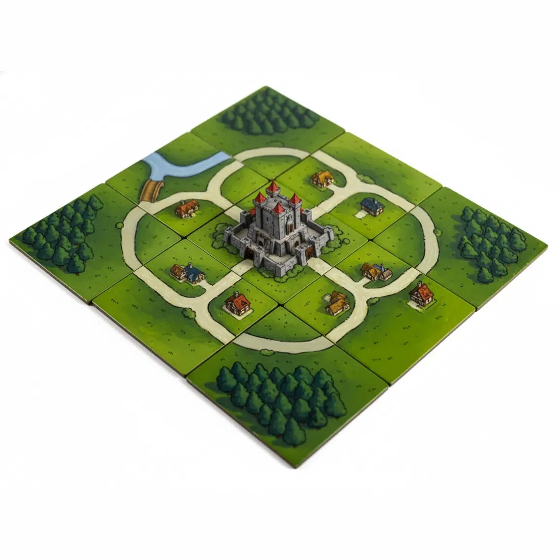
| Map and terrain modules in cardboard, plastic, or acrylic | |
| Punchboard chips, wooden discs, and counters for scores and resources | |
| Metal coins, wooden resources, plastic pawns, standees, and specialty parts | |
| Printed paper essentials for rules, currency, and scorekeeping |
Every component above is manufactured through our integrated production system — from component mapping and engineering review through sampling and mass production. Learn more about our complete custom board game printing services.
Why Choose FUNWAY
We have been making cards, puzzles, and board games since 1999. Today we run a 16,000-square-meter factory with over 200 workers. We are a direct OEM/ODM manufacturer, not a trading company. We have finished 5,000+ projects and shipped 2.3 million+ products worldwide. You get factory-direct pricing and a team that knows this work inside out.
We handle everything from design to final packing. You can order 1 piece for testing or 10,000 for a full launch — we keep the same quality at any quantity.

CE – EN 71 
amfori BSCI 
ESTS FSC COC 
SGS FSC COC 
ISO 9001:2015 -
ASTM F963-17


Why Bulk Buy From FUNWAY
Competitive Bulk Pricing

Factory-Direct Quality Control

On-Time Delivery Promise

1-on-1 Project Support

Trusted by Global Brands
Secure Payment & After-Sales
OEM / ODM Manufacturing Process

Step 1: Project Review & Component Mapping
We do not quote from a loose parts list. We quote from a complete product plan.
Before pricing, we map every component: board, cards, tokens, rulebook, insert, box, and accessories. We check how they fit as one packed set. This keeps the quote accurate. It also prevents surprises later in tooling, packing, and freight. We check:
Getting this order right keeps your project on budget and on schedule.
Step 2: DFM Check & Manufacturing Review
A bad sample usually starts from a design that was never checked for real production.
Before we build samples, we review your files for real-world manufacturing. We check dielines, bleed, safe zones, fold lines, card thickness, box depth, insert fit, and surface finish. We fix these issues before sampling:
If the packed set cannot close cleanly, changing the finish will not fix it. We fix the structure first.

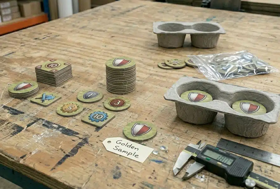
Step 3: Sample Production & Approval
The sample is not a photo shoot. It is the production standard.
We build the first sample to test material feel, fold strength, color accuracy, box fit, insert tightness, and total weight. You review it. You approve it. This approved sample becomes the Golden Sample. All mass production is checked against it.
After this point, changes to board size, card stock, insert, or box depth will restart cost and lead time. We keep the sample stable so your bulk order stays on track.

Step 4: Tooling & Mold Setup
We open tooling only after the Golden Sample is locked.
Tooling covers die-cut tools for cards, boards, punchboards, inserts, and boxes. For special plastic parts, we may need molds or fixtures.
We never rush tooling while the design is still moving. Once the die is made, changes cost time and money. We wait for your final approval before cutting steel.
This protects your tooling investment and keeps the project on schedule.
Step 5: Pre-Production Validation
Small errors are cheapest to catch before the full run.
We run a small pre-production batch. We check color drift, cutting position, fold accuracy, board thickness, surface finish, and component fit.
If anything does not match the Golden Sample, we stop and fix it before using more material. This step saves both time and cost.
This is why we never skip pre-production validation.

Step 6: Mass Production & Assembly
A game is not done when the parts are printed. It is done when the box closes properly.
Cards, boards, Punchboards, rulebooks, boxes, inserts, wooden pieces, dice, and accessories have to work as one packed set. During assembly, we check whether the approved packing layout still makes sense at production speed.
This is critical for B2B orders. Your distributor receives finished goods, not loose parts. Every set must be packed clean, stack flat, and ship safely.
We control assembly so your goods arrive ready for shelf or warehouse.

Step 7: Final QC & Global Shipping
A perfect product can still fail if the carton is wrong.
Before shipping, we check carton count, sets per carton, gross weight, carton size, shipping marks, and barcode labels. We match everything to your purchase order.
For B2B and retail orders, we also check pallet markings and stack height.
Small direct shipments get standard export packing. We ship by DHL, FedEx, or sea freight with full tracking. Every order leaves our factory with correct paperwork.
Why This Process Matters
Most problems do not show up early. They show up after one wrong decision forces the next.
This process is not meant to slow you down. For simple projects, we keep it fast. For complex projects with many parts, retail rules, or tight deadlines, these checks protect you from costly rework.
Tooling, Die-Cutting & Mold Selection
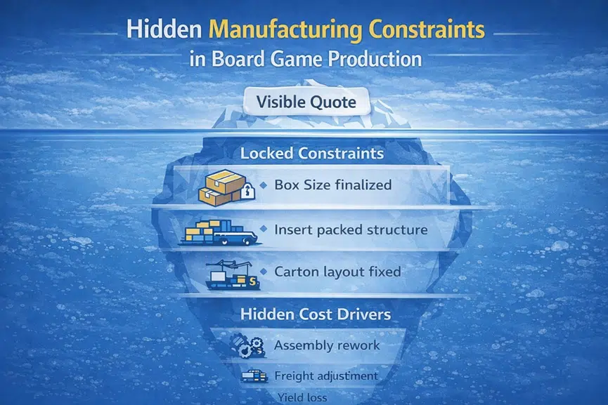
Token tooling is where many “small” design decisions become production problems. A token may only be 18–25 mm, but if the die line is too tight, the artwork is too close to the edge, or the material route is wrong, the problem repeats across hundreds or thousands of pieces.
For tokens, tooling is not only about making the shape.It decides the edge, the cut position, the stack feel, and whether the punch sheet saves material or creates more scrap. A shape that looks harmless in the file can create frayed edges, white borders, cracked acrylic corners, or a stack that no longer sits cleanly in the tray.
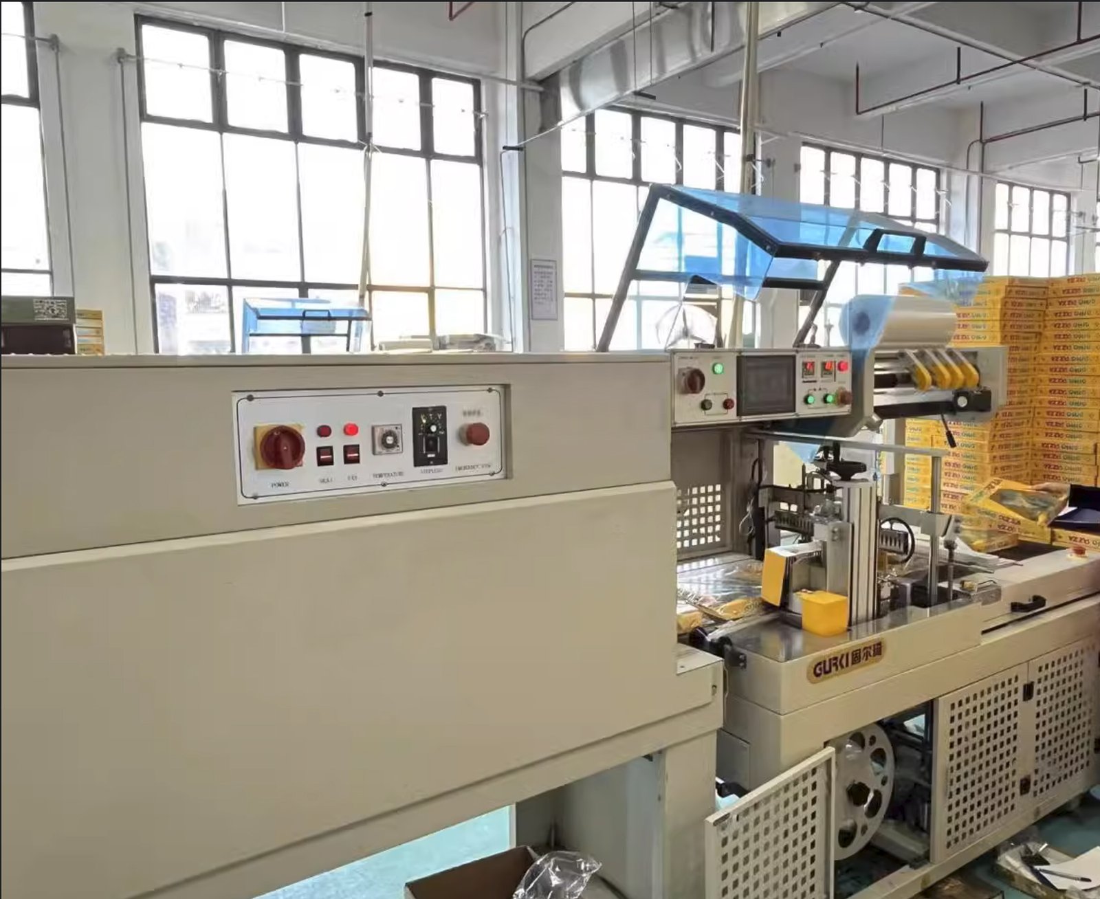
Punch Board Tooling for Cardboard Tokens
For printed cardboard tokens, we usually use punch board tooling / steel rule dies. This is the practical route for resource counters, currency, damage tokens, status markers, and other high-count printed token sets.
The die line has to respect both the artwork and the material. Small round tokens with centered rings, thin borders, or circular icons do not hide cutting movement well. Normal die-cut drift of about ±0.2 to 0.3 mm can already make the design look off-center.
Dense punch sheets also need enough spacing between pieces. If tokens are packed too tightly on the sheet, punching becomes less forgiving. Edges can crush, small bridges can tear, and waste removal becomes harder. Saving a little sheet space is not worth it if the punch-out result looks rough.
Mold Tooling for Plastic Tokens
Plastic tokens only make sense when the game needs more than a flat printed counter. Molded depth, washable handling, repeated flipping, snap-fit behavior, or heavy-use pieces can justify injection molding.
But a plastic token means a real mold decision. Gate position, parting line, shrinkage, wall thickness, and surface area for printing all need to be solved before tooling. If the gate lands on a visible face, the token looks marked before players even use it. If the wall is too thick, sink marks can show. If thickness is not controlled, stacked plastic tokens start looking uneven.
We do not move a simple printed token into plastic just to make it look “more premium.” If the token mainly carries icons, numbers, or resource artwork, punchboard is often cleaner and cheaper.
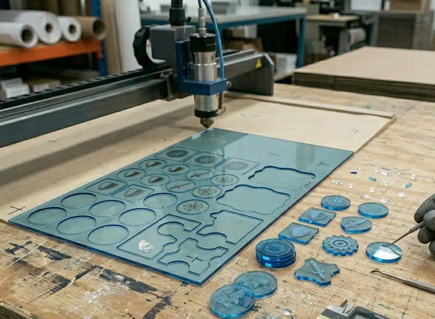
Laser or CNC Cutting for Acrylic Tokens
Acrylic tokens are usually cut, not punched like cardboard. The cutting path matters because acrylic does not forgive sharp corners and thin bridges very well.
Round or simple shapes are safer. Narrow points, tiny cut-ins, and sharp internal corners can chip during cutting, polishing, packing, or later handling. If the token is transparent or tinted, rough edges are also more visible than on cardboard.
Acrylic tooling should be kept for tokens where the clear or gem-like look is part of the game value. If the token is high-count or mostly information-based, acrylic usually adds cutting cost, edge risk, and packing protection without improving the play experience enough.
Wood Cutting or Engraving Setup
Wooden tokens are not small printed discs in another material. The shape has to work with the wood. Grain direction, moisture content, cutting path, and edge thickness all matter before we cut anything.
On wooden tokens, thin tips, narrow gaps, tiny cut-outs, and decorative corners are the first places I would question. The front shape is not the part I worry about most with wood. I worry about the cut edge. Burn marks, chipped corners, and rough grain show up there first. Make the token too thin, and it stops feeling like a game piece — it feels like something that should not be handled too much.
Wood works best when the token uses a bold shape and a simple mark: a resource piece, faction symbol, number, or engraved icon. If the design needs tight borders, small text, double-sided full artwork, or many colors, we usually move it back to printed cardboard instead of forcing wood to carry details it cannot show cleanly.
Pre-Production Sample & Production Checks
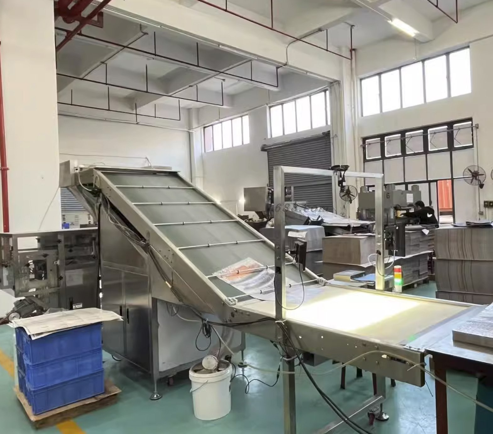
A token sample is not approved just because the print looks good. We have to check how it behaves as a real set: punched out, stacked, sorted by type, flipped by hand, packed into bags, and placed into the tray or insert.
Most token problems do not show up on one loose piece; they show up when the full set is checked together. One piece may look acceptable, but fifty pieces can expose thickness drift. One centered icon may look fine, but a full sheet can show die-cut movement. One edge may look clean, but repeated sorting can reveal white edge wear or fraying. These are the problems we try to catch before mass production, not after the full set is packed.
Thickness & Stack Consistency
Token thickness has to stay consistent across the full set. If thickness drifts, the problem is not always obvious on one piece. Stack them, count them, or put them into the tray cell, and the drift becomes much easier to see.
For high-count cardboard tokens, we check stack height against the approved sample. If a stack leans, feels uneven, or sits higher than expected, the insert and bagging plan may need adjustment. For plastic or acrylic tokens, we also check whether molded or cut thickness stays consistent enough for stacking and storage.
Die-Cut Edge & Punch-Out Quality
The edge tells us whether the tooling and material are working together. For cardboard tokens, we check whether the punch-out edge is clean, whether layers are crushed, and whether dark printed edges start showing white wear too early.
Small circles, narrow tabs, and icon-shaped tokens need extra attention. If the edge starts tearing, fraying, or delaminating during punch-out, the token may already look used before players touch it. We would rather adjust the die line or material build here than carry rough edges into production.
Artwork Position & Die-Cut Drift
Printed tokens need to be checked after punching, not only after printing. Thin borders, centered rings, circular frames, and small edge text make cutting movement easy to see.
For small round tokens, normal die-cut drift of about ±0.2 to 0.3 mm can already make the layout look off. The print may be correct, but once the cut shifts, the token no longer looks properly centered. This is why we check real punched samples before approving the full run.
Front-to-Back Registration
Double-sided tokens need another check: front-to-back position. A token can look centered on the front and still feel wrong when flipped over if the back artwork is slightly shifted.
For tokens with matching borders, icons, numbers, or orientation marks on both sides, we check whether the front and back artwork stay aligned after punching. If the design uses centered circles or tight frames on both sides, we usually ask for more tolerance before production.
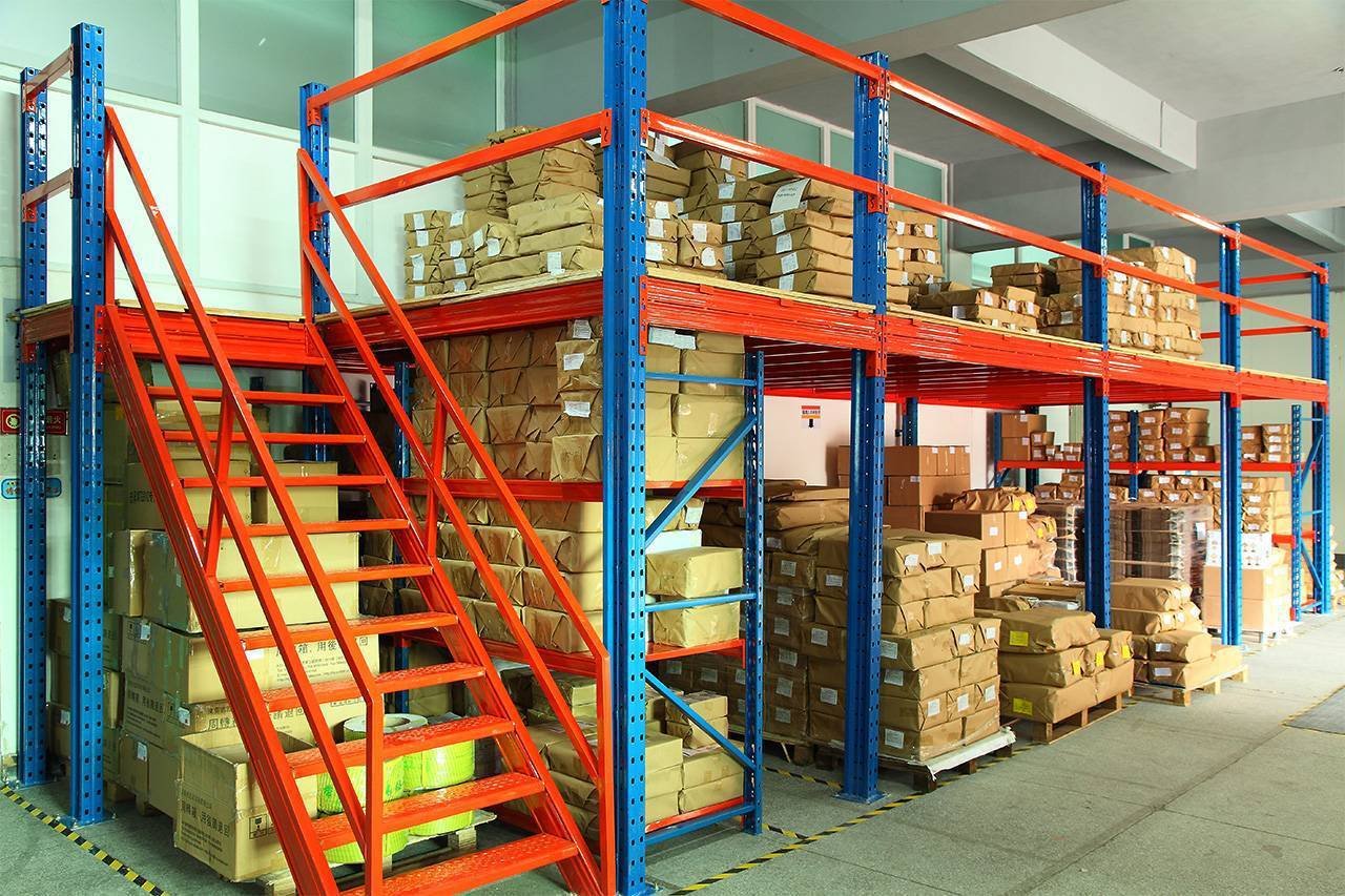
Tray, Bagging & Insert Fit
Tokens are rarely shipped loose as single pieces. They are packed by count, type, color, or player set. That means we check not only the token itself, but also how the full quantity fits in the real packing method.
The tray fit has to be checked with the final token build, not an early sample stack. Add the final thickness, surface finish, and bagging method, and the fit can change quickly. The bag may become too bulky, the tray cell may get too tight, or the token stack may start pushing into the rulebook, cards, or nearby components. We check the full token count against the tray, bag, and box layout before locking production.
Golden Sample Reference
Once the pre-production token sample is approved, it becomes the Golden Sample for production. It locks the material, thickness, edge quality, print position, color, finish, and packing fit.
For repeat orders, expansions, or multi-token systems, this matters a lot. Without a locked reference, the next batch can drift in thickness, color, edge finish, or artwork position while each individual token still looks acceptable by itself.
Cost Drivers & MOQ Optimization
Token cost is easy to underestimate because each piece looks small. But tokens rarely come alone. Once a game has 50, 100, or several hundred pieces, every choice gets multiplied: board thickness, die line, artwork spacing, finish, sorting, bagging, and tray fit.
The low-cost spec is not always the one that survives production best. Go too thin, and the token feels weak. Pack the punch sheet too tightly, and the edges start coming out rough. Use a centered ring, and normal die-cut drift becomes visible. Add a heavier finish, and punching may slow down. Make the stack thicker, and the tray or bag may need to change. These are the cost points we check before locking the token spec.
Material Route & Tooling
Cardboard is usually the most cost-efficient route for high-count printed token sets. The artwork is easier to control, the tooling cost is lower, and the tokens can be produced in sheets before punching.
Plastic, acrylic, and wood move the project into a different cost lane. Plastic needs mold tooling and sampling. Acrylic needs cutting, edge polishing, scratch control, and more careful packing. Wood needs cutting or engraving setup, moisture control, and simpler marking. We only move away from cardboard when the game actually needs harder wear, transparent effect, tactile feel, or molded structure.
Token Count, Sheet Yield & Punch Layout
Token count affects cost more than many customers expect. A few extra tokens may look harmless in the rulebook, but in production they can change the sheet layout, punch efficiency, sorting time, and packing method.
Punch sheet yield matters. If the token shapes fit the sheet cleanly, cost stays easier to control. If the tokens are irregular, oversized, or packed too tightly, waste goes up and punching becomes less stable. Saving a little sheet space is not worth it if the edges start crushing or the pieces become harder to remove cleanly.
Thickness, Stack Height & Packing
Thickness is a cost decision, not only a hand-feel decision. 1.5 mm can work for light-use, high-count cardboard tokens. 2.0 mm gives better handling for many standard sets. 2.5 mm gives the token more body, but the box has to pay for it: more board, taller stacks, deeper tray cells, bulkier bags, and sometimes higher carton weight.
Half a millimeter does not look serious on one token. Across 100 tokens, it becomes 50 mm of extra stack height. That can change the tray cell, make the bag bulkier, or force other components to move in the box. When token count is high, thickness needs to be priced together with packing, not as a simple upgrade.
Shape Complexity & Edge Risk
Round and simple square tokens are cheaper because they punch, sort, stack, and bag cleanly. Cost starts moving when the token has narrow bridges, sharp points, tiny internal cuts, irregular silhouettes, or notches.
Those details create real production risk. Cardboard can fray or delaminate around tight cuts. Acrylic can chip at sharp corners. Wood can burn or break at thin points. Plastic may need a mold adjustment before the shape releases cleanly. If the custom silhouette does not help gameplay, we usually simplify it before it becomes a tooling and scrap problem.
Printing, Finishing & Marking
Printed cardboard tokens need artwork setup, mounting, varnish or lamination, and die-cut alignment. Small tokens with centered rings, thin borders, or detailed icons need more tolerance, otherwise normal cutting movement becomes visible.
Finishing also changes cost. Varnish keeps the process lighter, but dark edges and frequently pinched borders wear sooner. Lamination gives better protection, but the film still has to go through the die. Tight curves, small tabs, and narrow details become less forgiving once a film layer is added. For plastic, acrylic, and wood tokens, the extra cost does not come from “printing” alone. It comes from setup and testing: whether pad printing will hold, whether UV ink has enough adhesion, whether laser engraving has enough contrast, and whether the mark survives the way players handle the piece.
MOQ & Setup Cost
Small token runs can be made, but low quantity does not make the preparation smaller. The factory still has to set up the print, mount the sheets, prepare the die, run samples, punch the pieces, sort the counts, bag the tokens, and check the tray fit before anything is ready to ship.
Standard round or square cardboard tokens are easier to keep under control because they share a cleaner production path. Once the project asks for custom silhouettes, thick board, acrylic cutting, plastic molds, wood engraving, or several finishing steps, the setup cost starts sitting heavily on each token.
At low quantity, that is usually where the price looks painful. Not because the token itself is large, but because the job still needs all the same setup before the first usable batch comes out.
Project Cases

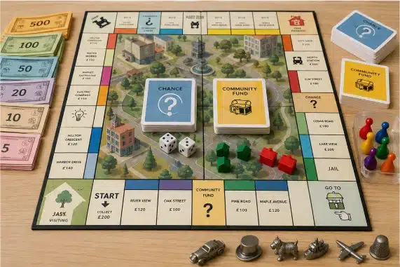
Monopoly-Style Trading Game
A U.S. client brought this project to us in February. The game idea was already close to a Monopoly-style property trading game, but the physical parts were not ready for production yet. We made the first sample with a quad-fold board, paper money, pawns, dice and house tokens. The packing was adjusted once before the bulk order.
At the beginning we used standard game pieces first. No new mold at this stage. The client wanted to test the rules and artwork before putting more budget into custom parts. After sample approval, the same build went into a 3,000-set run. Before shipment, we also helped arrange SGS China testing for ASTM F963 / CPSC requirements for U.S. sales.

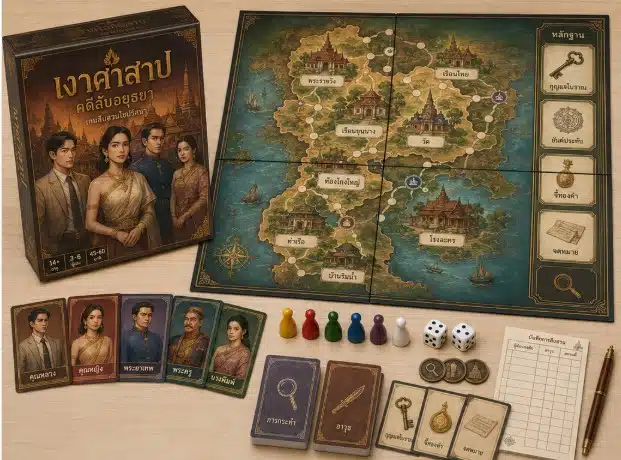
Clue-Style Mystery Game
A Thai client came to us with a mystery deduction board game idea. The rough direction was already close to a Clue-style game, but the physical parts were not ready for production. We helped fix the card groups and card quantity first, then prepared dieline templates for the cards, board and box.
The first images were made with AI, but some faces, rooms and board details were not suitable for direct printing. We helped the client find a designer in China to rebuild the artwork into printable files. Once the sample was approved, the same card count, board layout and packing structure was adopted for the bulk production.
YOU MAY ALSO LIKE
Manufacturing Insights
Custom Board Game Pricing Guide (2026)
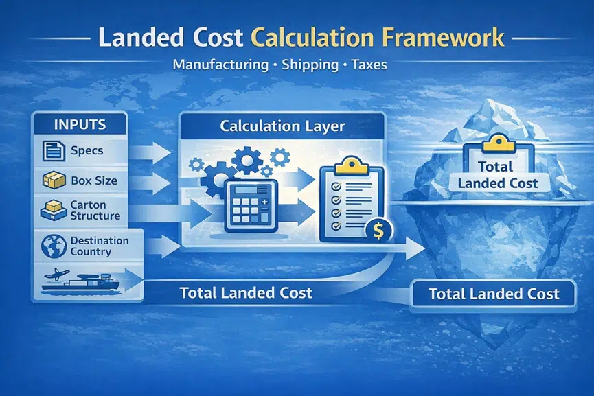
Wondering how much it costs to make a board game? Get real factory pricing examples ($4.5-$26/set), hidden shipping fee calculations,…How to Calculate the True Landed Cost of a Custom Board Game
Stop losing your crowdfunding profit to unexpected shipping bills. Learn how to calculate the true landed cost of a custom…Puzzle Materials: Blue core Cardboard Vs. Standard Cardboard
What material are puzzles made of? Learn about puzzle cardboard material from a real factory. We compare blue core, white…What to Prepare Before Requesting a Custom Board Game Quote
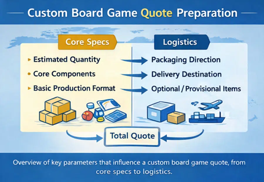
How to Organize Your Specifications Before Contacting a Manufacturer Requesting a custom board game quote should be a straightforward step,…